
")
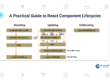
Styling React Native Apps
If you ever used React Native, you probably realized it doesn’t use normal HTML & CSS like a web application. In this guide, we will discuss the differences. And one of the main differences you will see is everything is automatically styled based on Flexbox.
Now if you wanted, you could simply import the styled-components library and use normal CSS like that. That is a great library and I would recommend it. But, if you want to get used to styling in a Native app, let’s see how to do that.
StyleSheet
The first thing to know about React Native styling, is to use the StyleSheet component. Import it like this:
Copy
After that, you can use it like this:

Copy
Then, add it to style your component appropriately, like this:
Copy
You could go the inline road, like the following and you would end up with the same thing:
Copy
Pixels?
Looks pretty similar to CSS, right? It is, in general, named the same, to reflect CSS, but you may notice we did not indicate any unit to the “100” in height: 100. You may be used to writing “px”, “vm”, etc. And the question is, what units are used by default in React Native?
That is a pretty complex question, which has taken more than one article to answer. For iOS, they are “logical points”, and Android uses DIP. There is a lot of reasoning behind this, as well as the logic as to why this was chosen. The short of it is, there are many different screen sizes and different resolutions on the same screen size. So, if we used normal pixels, it would look pixelated on some phones; but the idea behind “points” is to make things look relatively the same on a pixel-dense, high-resolution screen, as it does on an low-resolution screen.
The good thing is, this will handle most of the styling for you, from iOS to Android. Though it isn’t perfect, it will look roughly the same from one platform to the other. There is a calculation that goes on behind the scenes to determine what your height, width, borderWidth, etc, would look like on the screen.
You can also use ‘auto’ or percentages, but you wrap it in quotes, like this:
Copy
Wrap Entire Screen
Now, one thing to know about setting a View to fill the entire screen, is a phone like the iPhoneX has part of the screen covered. Normally, part of your screen which you put your elements in, will be hidden under the covered part of the screen. For this, simply use the React Native component SafeAreaView to wrap the rest of your components and you can be sure you will see all of your screen.
Another way is simply styling with flex: 1. Remember, React Native uses Flexbox by default so you don’t need to worry about applying display: flex to anything. But why would adding flex: 1 fill the height of the screen?
Well in React Native the default flexDirection is column, unlike in the web version. You could set the flexDirection, but if not, flex: 1 stretches down the main axis, which is by default column. And if you know Flexbox, you know that if there is no other element, flex: 1 fills the entire main-axis of the parent container.
Margins and Padding
One of the nice things about styling in React Native is the added styles to margin and padding. Both of them come with a way to set top and bottom in one line, as well as left and right in one line. Both of them use the words, Horizontal and Vertical.
For instance, to give an element a top and bottom margin of 20 you could set in like this:
You could also give it padding of top and bottom with paddingVertical: 20. The other is like this paddingHorizontal and marginHorizontal.
Now these are nice, but you may notice you cannot do what you would do in the web, like this: margin: ’20 0 20 0′. That won’t work in React Native.
There is also “Start” and “End” you can tag on the end of margin and padding. Whenever you see “start” and “end” in styles, you can know these depend on the flexDirection of the container – if the direction is row then marginStart is equal to marginLeft. If the flexDirection is row-reverse then marginStart would be equal to marginRight. Also, keep in mind, “start” and “end” override marginLeft and marginRight, paddingLeft and paddingRight.
Shadows and Borders
The normal border style in CSS is not available in React Native styles. You have to break it down into borderColor and borderWidth. With those two indicated, you have enough for a border. Also, you can pick which side receives which color/width.
There’s also borderRadius, as you may be used to, that gives a radius to each corner. You can pick each individual radius with top-start, top-end, bottom-start, or bottom-end, like this: borderTopStartRadius: 20, or you can use the easier top-left, top-right, and so on. Finally, you can use borderStyle to pick from dashed, dotted, or solid borders.
As for shadows in React Native, you won’t be using the box-shadow you might be familiar with. Instead, React Native has styles that only work in iOS. Use these three styles: shadowOffset: { height: 3, width: 3 }, shadowColor: ‘#0000’, shadowOpacity: 0.5, shadowRadius: 5 }. These shadows work pretty well and if you are familiar with box-shadow from the web, these will be a cinch.
But, in Android, there isn’t a great, built-in solution with React Native. You can set the elevation property, but this isn’t customizable and won’t work well with other styles – such as border and background colors. For Android I would suggest react-native-shadow.
Platform-Specific
In the last section, we saw the first major difference between platforms: one has shadow styles, but the other doesn’t. Now the good thing is, in the example above, Android will simply ignore the styles it doesn’t support. It won’t work, but at least you won’t receive any errors. That’s true for the most part with all styles you’ll find that aren’t supported by a platform – it will be ignored.
However, you’ll find quite a lot of difference in appearance from one platform to the other, even with perfect, clean styles. It’s simply bound to happen. To make the styling look similar across platforms, let’s import the Platform component from React Native. Once imported you can set up your styles to be dynamic, platform dependent.
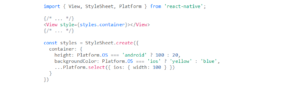
Copy
Notice the two different ways here to set platform-specific styles. One way comes after the style prop, using a ternary operator, height: Platform.OS === ‘ios’ ? 100, 20. This works well in most situations, but what if you don’t even want to set a style in one platform? That’s where …Platform.select() comes in. This allows you to specify a style on one platform only, or both: …Platform.select({ ios { width: 100 }, android: { width: 75 } }).
Other
Now styling gets much more deep and complex than this article can cover. You’ll notice in React Native that styles are different from component to component, unlike the web where basically every element can use every style. If you look at the official React Native docs (this is the style prop in the Text component), you will see a list of the components, and under each one, a list of styles you can use to design the component. You’ll find these a bit limited compared to the web, and some, like the Button component, don’t even have a style prop.
Much of the time, you can use components like TouchableOpacity and of course, View, which have most of the styling props available.