
")
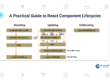
Flutter for React Native developers
What’s Flutter and React Native
React Native is a project started by Facebook internally that they open-sourced in 2015. On the other side is Flutter, a project started by Google which they have been heavily promoting since I/O 2017. Both of these technologies help app developers build cross-platform apps faster by using a single programming language. React Native is already a mature tool and has a huge community, but Flutter also started seeing huge adoption rates since 2017.
React Native — JavaScript
● React Native uses JavaScript to build cross-platform apps.
● JavaScript is a dynamically typed language and anything can be done with JavaScript, which is good and bad at the same time.
● React Native uses the Flux architecture from Facebook.
Flutter — Dart
● Flutter uses Dart programming language which was introduced by Google in 2011 and is rarely used by developers. Dart syntax is easy to understand for JavaScript or Java developers as it supports most of the object-oriented concepts.
● The Dart framework uses Skia C++ engine which has all the protocols, compositions and channels.
● Flutter engine has most of the native components in the framework itself and it doesn’t always need a bridge to communicate with the native components.
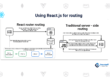
Introduction to Dart for JavaScript Developers
Like React Native, Flutter uses reactive-style views. However, while RN transpiles to native widgets, Flutter compiles all the way to native code. Flutter controls each pixel on the screen, which avoids performance problems caused by the need for a JavaScript bridge.
Dart is an easy language to learn and offers the following features:
● Provides an open-source, scalable programming language for building web, server, and mobile apps.
● Provides an object-oriented, single inheritance language that uses a C-style syntax that is AOT-compiled into native.
● Transcompiles optionally into JavaScript.
● Supports interfaces and abstract classes.
React Native and Flutter widget equivalent components
The following table lists commonly-used React Native components mapped to the corresponding Flutter widget and common widget properties.
| React Native Component | Flutter Widget | Description |
| Button | Raised Button | A basic raised button. |
| onPressed [required] | The callback when the button is tapped or otherwise activated. | |
| Child | The button’s label. | |
| Button | Flat Button | A basic flat button. |
| onPressed [required] | The callback when the button is tapped or otherwise activated. | |
| Child | The button’s label. | |
| ScrollView | ListView | A scrollable list of widgets arranged linearly. |
| children | ( [ ]) List of child widgets to display. | |
| controller | [ Scroll Controller ] An object that can be used to control a scrollable widget. | |
| itemExtent | [ double ] If non-null, forces the children to have the given extent in the scroll direction. | |
| scroll Direction | [ Axis ] The axis along which the scroll view scrolls. | |
| FlatList | ListView. builder() | The constructor for a linear array of widgets that are created on demand. |
| itemBuilder [required] | [ Indexed Widget Builder] helps in building the children on demand. This callback is called only with indices greater than or equal to zero and less than the itemCount. | |
| itemCount | [ int ] improves the ability of the ListView to estimate the maximum scroll extent. | |
| Image | Image | A widget that displays an image. |
| image [required] | The image to display. | |
| Image. asset | Several constructors are provided for the various ways that an image can be specified. | |
| width, height, color, alignment | The style and layout for the image. | |
| fit | Inscribing the image into the space allocated during layout. | |
| Modal | ModalRoute | A route that blocks interaction with previous routes. |
| animation | The animation that drives the route’s transition and the previous route’s forward transition. | |
| Activity Indicator | Circular Progress Indicator | A widget that shows progress along a circle. |
| strokeWidth | The width of the line used to draw the circle. | |
| backgroundColor | The progress indicator’s background color. The current theme’s ThemeData.backgroundColor by default. | |
| Activity Indicator | Linear Progress Indicator | A widget that shows progress along a circle. |
| value | The value of this progress indicator. | |
| Refresh Control | Refresh Indicator | A widget that supports the Material “swipe to refresh” idiom. |
| color | The progress indicator’s foreground color. | |
| onRefresh | A function that’s called when a user drags the refresh indicator far enough to demonstrate that they want the app to refresh. | |
| View | Container | A widget that surrounds a child widget. |
| View | Column | A widget that displays its children in a vertical array. |
| View | Row | A widget that displays its children in a horizontal array. |
| View | Center | A widget that centers its child within itself. |
| View | Padding | A widget that insets its child by the given padding. |
| padding [required] | [ EdgeInsets ] The amount of space to inset the child. | |
| Touchable Opacity | Touchable Opacity | A widget that detects gestures. |
| onTap | A callback when a tap occurs. | |
| onDoubleTap | A callback when a tap occurs at the same location twice in quick succession. | |
| Text Input | Text Input | The interface to the system’s text input control. |
| controller | [ Text Editing Controller ] used to access and modify text. | |
| Text | Text | The Text widget that displays a string of text with a single style. |
| data | [ String ] The text to display. | |
| textDirection | [ Text Align ] The direction in which the text flows. | |
| Switch | Switch | A material design switch. |
| value [required] | [ boolean ] Whether this switch is on or off. | |
| onChanged [required] | [ callback ] Called when the user toggles the switch on or off. | |
| Slider | Slider | Used to select from a range of values. |
| value [required] | [ double ] The current value of the slider. | |
| onChanged [required] | Called when the user selects a new value for the slider. |