
")
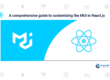
Using Material Design in Angular 2
To get started with Angular 2 and Material Design just go through the following steps:
1) Start with a new project setup
By following the Angular 2 quickstart tutorial you can set up a new base project structure:
|-app
— |-app.component.ts
— |-app.module.ts
— |-main.ts
|-index.html
|-package.json
|-systemjs.config.js
|-tsconfig.json
|-typings.json
2) Introduce Material Design
Angular 2 Material Design Components are available as NPM packages. A full list of packages can be found at http://www.npmjs.com/~angular2-material
A general introduction and overview of Google’s Material Design can be found at https://material.google.com/.
Created and designed by Google, Material Design is a design language that combines the classic principles of successful design along with innovation and technology. Google’s goal is to develop a system of design that allows for a unified user experience across all platform.
3) Install Angular 2 Material Design NPM Packages
Angular 2 Material Design NPM packages can be installed by using the *npm*
command like you can see in the following:
$ npm install — save @angular2-material/core @angular2-material/button @angular2-material/card @angular2-material/icon
Note: The core module is always required as a peer dependency of other components
4) Install HammerJS
We need to add the third-party library HammerJS to our project. Hammer add support for touch gestures and is used by the Icon Material components. HammerJS is available as a NPM package, so we can install and add it to the project dependencies by using the following command:
$ npm install hammerjs –save
And the corresponding typings via:
$ typings install dt~hammerjs –save –global
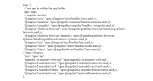
5) SystemJS Configuration
Next, add the Angular 2 Material NPM packages to systemjs.config.js by using the UMD (Universal Module Definition) files:
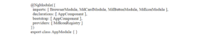
6) Import Material Modules and Providers in AppModule
We are only using one Angular 2 module in our application (AppModule). We need to make the Angular 2 Material elements available within this module. First add the corresponding import statements:
Next the modules needs to be added to the array which is assigned to the imports property of the @NgModule decorator. MDIconRegistry needs to be added to the array which is assigned to the providers property:
7) Include Google Material Icon Font in index.html
By default Material Icons make us of the Google Material Icon Font, so we need to import the font in index.html:
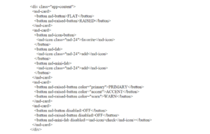
8) Implement AppComponent template in app.component.html
We’re implementing the component’s template by making use of Material Card, Buttons and Icons:
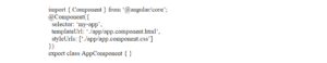
Include the external template file in the component decorator:
9) Add some styling
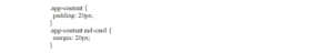
In addition we can add some CSS styling. Add the styleURLs property to @Component and point to the external styling file app.component.css:
Create the CSS file in the app folder and insert the following content:
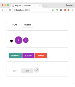
10) Final Result
Having finished the implementation we can start up the application by using the following command:
$ npm start
and view the final result in the browser: