

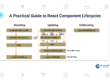
5 Trending UI Libraries For ReactJS
Ant Design
Ant Design is a React UI framework and UI design language for businesses. It is the most popular React UI Libraries, per GitHub Stars. There are over 100 parts total, from typography to tables. The Ant Design paper is well-organized and includes numerous examples.
More than only development time is saved by Ant Design. Offering Sketch and Figma files for each component also saves designers’ time. The Ant Design component supports both JSX and TypeScript. The ant theme is also quite adaptable. Because Ant Components provides prebuilt form components, ReactJs developers can manage forms and validation much more quickly. Ant Design also supports the use of hooks.
React Bootstrap
React components can use Bootstrap JS thanks to React Bootstrap. There is no jQuery used in the creation of React Bootstrap components. React Bootstrap contains all of the bootstrap elements that we use with JavaScript. It now features Bootstrap 5, which is in the beta stage. Code samples and well-written documentation are included with React Bootstrap.
Bootstrap React-Bootstrap is used in place of JavaScript. Each component was built entirely as a React component, free of extra dependencies like jQuery.
React-Bootstrap is a fantastic option for your UI base because it has developed and grown, with React serving as one of the early libraries.
We embrace the bootstrap core and strive to be compatible with the biggest UI ecosystem in the world with compatibility at the forefront of our minds. React-Bootstrap is compatible with the thousands of popular Bootstrap themes because it only uses Bootstrap CSS.
Semantic UI React
A UI component architecture called Semantic is built on concepts from natural language. Semantic UI React is the authorized Semantic-UI-React integration. It has more than 50 components, is jQuery-free, and has additional capabilities like Auto Controlled State and Sub Components. If your React app needs semantic UI, this package is advised.
Semantic user interfaces use words and classes as interchangeable concepts. Classes make use of word order, plurality, and other natural language syntaxes like noun/modifier link to organically connect ideas. Additionally, Semantic uses short phrases called actions to turn on functionality. Every arbitrary choice made by a component is represented as a setting that programmers can alter.
Material UI
In a word, Material-UI is an open-source project with React components that implement Google’s Material Design. It started in 2014, just after React was made available to the general public, and its popularity has grown ever since.
The most popular React UI library is this one. For making React projects more quickly, more attractively, and more easily accessible, it is a straightforward and flexible component framework. There are over 100 components in Material-UI. Over a thousand icons are also included.
Designers can download paid Sketch, Figma, and Adobe Xd files from Material-UI. Well-known companies like Spotify, NASA, Netflix, Amazon, and others use Material-UI. Code samples and well-written documentation are included with Material-UI.
Chakra UI
A collection of reusable, composable, and easily accessible React components called Chakra UI makes it simple to create web pages and apps. Chakra UI components provide the necessary aria-* characteristics and follow the WAI-ARIA standards guidelines. The Chakra UI community is growing quickly as a result of its performance and experience. Chakra UI also includes nicely written documentation and code examples.
More than 210 components with source code are included in Chakra UI Pro to make building your project faster and simpler. All parts are equipped with both a bright and a dark color mode out of the box. As necessary, you can change the elements, your style, and your brand. That’s how simple it is. Additionally, it has responsive features that look fantastic on desktop, tablet, and mobile devices. Each piece of code you’ll get is written in TypeScript and made specifically to function with Chakra UI. Components are properly divided into numerous files for a better development experience. Accessibility is the most important factor. Accessibility is given top priority as a result.