
")
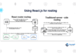
Understanding Flexbox in React Native
Mastering these simple Flexbox recipes will make you a React Native UI master in no time.
Getting Started
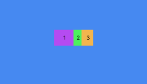
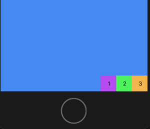
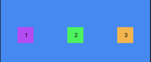
Lets start with a simple example. A container View component with three Text components.
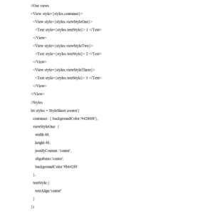
Which renders as so:
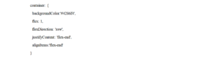
Styling the Container
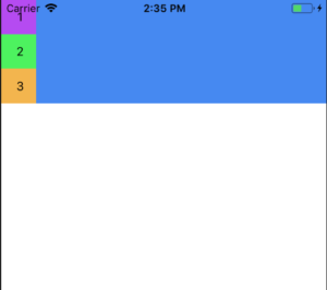
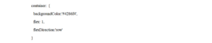
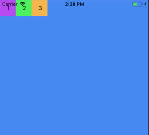
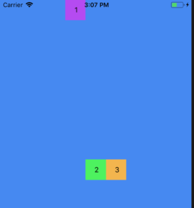
Now we add flex:1 to the container:
This makes container fill its parent, i.e. whole screen.
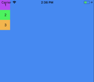
Now we add:
Each view’s flexDirection is set to colum by default but setting it to ‘row’ will change the orientation of the items in the container.
Now we can control the orientation of the content using flexDirection.
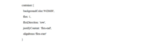
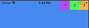
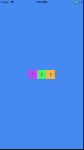
Now lets add justifyContent and align-items :
Similarly for:
Views will render like:
• flexDirection determines the primary axis as ‘row’ or ‘column’.
• justifyContent determines distribution of children along primary axis.
• alignItems determines the alignment of children along the secondary axis.
To set items to center :
justifyContent: ‘center’,
alignItems:’center’
justifyContent supports flex-start, center, flex-end, space-around, and space-between.
For space-around:
and space-between:
alignItems supports: flex-start, center, flex-end, and stretch.
Overriding the Container Style
If we need an item to override it’s defined as defined by the container we could use style the items individually.
alignSelf overrides alignItems and supports these options auto, flex-start, flex-end, center, stretch and baseline.
If we tell an item to align itself to flex-start,
alignSelf: ‘flex-start’
It would end up like this:
flexGrow controls how much the item will grow relative to the rest of the flexible items inside the same container.
flexGrow: 1
Would render as:
flexBasis controls the item size with percent. For eg:
flexBasis:50 //firstView style
flexBasis:20 //secondView style
flexBasis:30 //ThirdView style